
Median net revenue retention across private B2B SaaS companies was 102% in 2023 and 101% in a 2025 study of more than 1,000 companies, while median gross revenue retention was 91%. That gap is the warning: headline NRR can look healthy while upsells cover meaningful customer losses.
Founders often treat NRR as the final answer because it compresses churn, downgrades, and expansion into one investor-friendly figure. I treat it differently. NRR is a hypothesis about product durability, and you test that hypothesis by separating cohort behavior, gross retention, customer counts, and the expansion revenue doing the heavy lifting.
A trustworthy retention story doesn't merely say customers are worth more today than when they started. It shows which customers stayed, which customers left, how much revenue was lost, and whether the same pattern holds across cohorts and plans. That distinction matters on a fundraising page, where backers need evidence they can inspect rather than a carefully selected score.
Table of Contents
- Why SaaS Retention Metrics Usually Lie to Founders
- The Three Retention Metrics You Should Track Together
- How to Measure Retention Using Cohorts Instead of Averages
- Why Retention Benchmarks Change Across ARPA and Pricing Tiers
- Turning Retention Data Into Trustworthy Traction for Backers
- Using Fundl to Publish Live Cohort Retention and Verified Traction
- Common Retention Mistakes That Hide Real Churn Risk
- Frequently Asked Questions About SaaS Retention Metrics
Why SaaS Retention Metrics Usually Lie to Founders
The retention illusion starts when one number gets asked to carry too much meaning. A company can report expanding recurring revenue while smaller accounts disappear, provided a few larger customers upgrade enough to offset the losses. The NRR is mathematically correct, but the conclusion that customers broadly find durable value may be wrong.

A quarterly dashboard can also hide lifecycle differences. New accounts may still be completing onboarding, long-standing customers may have expanded, and an older cohort may be contracting. Blending them into one period average makes the product look more consistent than the underlying customer experience.
The number isn't the evidence
The calculation for NRR is straightforward: beginning recurring revenue, minus churn and contraction, plus expansion revenue, divided by beginning recurring revenue. Above 100%, the existing customer base is expanding without new logos. Below 100%, expansion isn't replacing lost or reduced revenue.
That definition makes NRR valuable, but it doesn't make it sufficient. A high result can reflect genuine adoption across many accounts, or it can reflect concentration in a small number of expansions. Those are different businesses with different fundraising risks.
Practical rule: Treat every headline retention number as a question. Ask which cohort produced it, how many logos remained, and what portion came from expansion.
Audit optics before defending performance
Before sharing retention with backers, freeze the starting cohort and define the observation window. Separate voluntary cancellations from involuntary payment failures, distinguish annual from monthly plans, and show plan mix beside the result.
The strongest reporting makes uncomfortable patterns visible. If recent cohorts fall away faster than earlier cohorts, say so and explain what you're changing. If logo retention is weakening while NRR rises, disclose that expansion is concentrated. Transparency creates more confidence than an artificially smooth trend.
The Three Retention Metrics You Should Track Together
A useful SaaS retention dashboard pairs net revenue retention, gross revenue retention, and cohort logo retention. Each metric answers a different question, and each exposes a blind spot in the others.
NRR asks whether the existing revenue base grew. Its formula includes churn, downgrades, and expansion. That makes it the right measure for expansion power, pricing depth, and account growth, but it can conceal broad customer losses when larger accounts expand.
GRR asks how much starting revenue survived before expansion. Because it excludes upsells and increased usage, GRR gives a cleaner view of pure retention. It can't exceed 100%, so a weak GRR can't be rescued by an unusually successful expansion motion.
Logo retention asks how many actual accounts remain. It gives every customer one vote, regardless of contract value. That makes it essential for detecting broad attrition that revenue-weighted metrics can hide.
Historical benchmarks reinforce why the three metrics belong together. Median NRR across private B2B SaaS companies was 102% in 2023, unchanged from 2022, while a separate 2025 study of more than 1,000 private B2B SaaS companies reported median NRR of 101% and median GRR of 91%. The figures are summarized in Orb's overview of NRR statistics.
| Metric | What It Captures | What It Can Miss |
|---|---|---|
| NRR | Churn, contraction, and expansion within an existing revenue cohort | Customer losses masked by expansions |
| GRR | Pure revenue retention before upsells or increased usage | Whether retained accounts expand later |
| Cohort logo retention | The share of original customer accounts still active | The financial importance of each account |
Use the metrics as a diagnostic sequence rather than a ranking. If NRR is strong and GRR is weak, expansion may be carrying the business. If GRR is stable but logo retention falls, larger accounts may be masking widespread small-account churn. If both logo retention and revenue retention improve together, the evidence for repeatable product value is much stronger.
How to Measure Retention Using Cohorts Instead of Averages
Aggregate monthly churn mixes customers at different lifecycle stages. A recently signed account, a mature customer, and an account approaching renewal can all appear in the same denominator, so the resulting rate tells you little about where the product loses people.
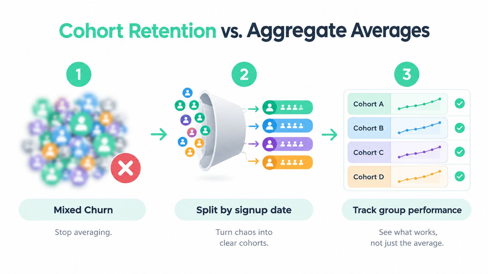
Cohort analysis fixes that by grouping customers according to a shared start point, such as signup month or paid-start month. You then observe each group at fixed ages, rather than allowing new sales to dilute the apparent churn of older customers.
Build the retention curve
For each cohort, calculate customer retention at fixed ages such as 30, 60, 90, and 365 days. The formula is:
Customers active at period N divided by customers in the original cohort.
Plot those values as a curve. A steep early decline usually points to onboarding, activation, expectation, or product-value problems. A curve that flattens suggests that customers who reach a meaningful use case tend to remain active, which supports more reliable lifetime-value estimates. This interpretation is also explained in Scaleon's guide to cohort retention curves.
Don't use a cohort matrix only for logos. Build a matching revenue view with GRR and NRR over a defined rolling observation window. A customer-count curve can remain stable while account value contracts, and revenue retention can improve while the number of active customers falls.
Freeze the denominator
The starting cohort must remain fixed. Don't add later signups to the original group, and don't compare one quarter's mixed population with another quarter's carefully defined cohort. Record the cohort size, signup or paid-start date, plan, acquisition channel, and contract type.
A practical retention dashboard might contain:
- Logo retention: Active customers from the original cohort.
- GRR: Starting cohort revenue after churn and contraction.
- NRR: Starting cohort revenue after churn, contraction, and expansion.
- Activation time: The time required to reach the first meaningful outcome.
- Cancellation reason: A consistent category for why the account left.
Your data pipeline matters as much as the formula. Connecting billing, product analytics, and customer records through a documented process, such as the one described in this guide to integrating data sources, helps prevent mismatched account IDs and shifting definitions.
A retention curve should make the customer journey easier to see, not make a weak month disappear inside a larger average.
Why Retention Benchmarks Change Across ARPA and Pricing Tiers
A retention benchmark without pricing context is often a comparison between different businesses. A low-priced self-serve product has limited room for expansion, while a high-value account may add seats, modules, usage, or services over time. Their NRR ceilings and servicing economics aren't interchangeable.
An analysis of more than 2,100 SaaS businesses found that only 2.7% of companies with ARPA below $10 per month achieved NRR above 100%, compared with 41.1% of businesses whose ARPA exceeded $500 per month. Among companies with $3 million to $15 million in ARR, the top-quartile NRR benchmark was 99%. These comparisons come from the SaaS Capital retention benchmark report.
The result isn't that low-priced products are weak. It means expansion-led retention is harder when customers have little contract value to expand and when acquisition relies on a large volume of smaller accounts. A self-serve product may still have excellent product value, but logo durability, repeat usage, and efficient acquisition may matter more than exceeding 100% NRR.
| Pricing Tier | Expansion Potential | Likely Retention Pattern |
|---|---|---|
| Low-ARPA self-serve | Limited account-level expansion | Logo retention and repeat usage carry more weight |
| Mid-market subscription | Moderate seat, plan, or usage expansion | GRR and NRR need to be read together |
| Higher-value accounts | Greater room for expansion and cross-sell | NRR may benefit from a smaller number of large accounts |
Contract structure changes interpretation too. Annual and multi-year customers have different renewal moments from month-to-month users, so founders should separate those plans rather than pool them into a single score. Track retention by plan, ARPA, acquisition channel, contract length, and cohort.
Backers don't need you to match an enterprise benchmark with a self-serve product. They need to know that your target reflects your model and that you can explain the trade-off. A credible page might show strong repeat usage and stable logo retention for a low-priced product, even when expansion contributes little. That is more useful than presenting an inflated NRR that depends on a handful of upgrades.
Turning Retention Data Into Trustworthy Traction for Backers
Backers can trust retention when they can understand the denominator. A headline such as “NRR above 100%” has limited meaning unless the page also identifies the starting cohort, observation window, plan mix, and treatment of churn.
Start with a compact evidence panel:
- Cohort definition: State whether the group begins at signup, paid conversion, or another event.
- Cohort size: Show how many accounts or customers entered the measurement.
- Observation window: Specify whether the result covers a monthly, quarterly, or annual period.
- Revenue view: Publish GRR and NRR together.
- Customer view: Show logo retention separately from revenue retention.
- Churn classification: Distinguish voluntary cancellations, failed payments, downgrades, and contractions.
Then add a cohort matrix. Backers should be able to see whether recent cohorts retain better or worse than earlier groups, not just the blended company average. If expansion drives the headline, disclose the share of retained revenue associated with account growth rather than leaving readers to infer it.
A live page is more credible than a static screenshot because the source connection and refresh behavior are visible. The same principle applies to broader fundraising evidence. Founders working on acquisition and awareness can use this guide to B2B demand generation alongside retention reporting, but demand signals shouldn't substitute for customer durability.
Make the audit trail readable
Don't publish a spreadsheet dump. Give each metric a definition, a source, and a timestamp, then let readers move from the headline to the underlying cohort view. Keep the calculation rules stable, and record any change in account status or billing treatment.
A transparent traction page should help a backer answer three questions quickly:
- Are customers staying?
- Is revenue holding without expansion?
- Is growth broad or concentrated?
For a broader framework on connecting evidence to a fundraising narrative, see Fundl's data-driven fundraising guide. The page should make your strongest signal easy to verify and your weakest signal impossible to overlook.
Using Fundl to Publish Live Cohort Retention and Verified Traction
Most early-stage founders keep retention in a spreadsheet, then paste a selected figure into a pitch deck. That workflow creates version drift, makes source verification difficult, and encourages teams to discuss the result instead of showing how it was produced.
Fundl lets creators connect Stripe, GitHub, and analytics data to a shareable traction page. For a SaaS project, that can place revenue, product activity, and retention signals in one evidence layer, with metrics refreshed from connected sources rather than maintained as screenshots.
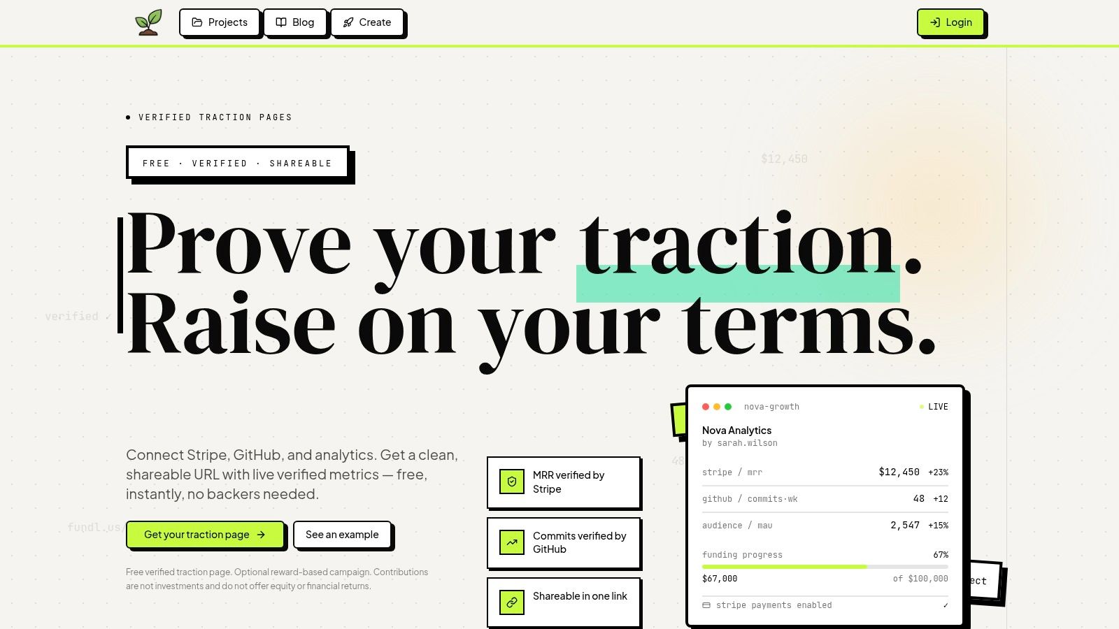
The important distinction is verification, not presentation polish. A backer can compare recurring revenue with customer activity and shipping signals, then inspect whether the retention story is supported by ongoing behavior. That doesn't remove the need for clear cohort definitions, but it gives those definitions a visible home.
Tools and services such as Faberwork from Faberwork LLC can also be relevant when a founder needs help turning operational data into usable systems. The choice of tool matters less than maintaining consistent definitions across billing, analytics, and customer records.
Fundl's page can serve as the public layer for a measurement process that remains rigorous behind the scenes. Keep the cohort calculations documented, expose the observation window, and show logo retention beside GRR and NRR. Contributions are processed through the creator's own Stripe account, while the traction page gives backers a direct view of connected evidence.
The strongest fundraising conversation starts when nobody has to take the headline on faith. Live, source-connected evidence lets you spend less time defending a screenshot and more time discussing what the customer behavior means.
Common Retention Mistakes That Hide Real Churn Risk
The most damaging mistake is treating NRR as proof of broad product stickiness. Expansion can lift revenue while logo retention falls, especially when a few larger accounts carry disproportionate weight. Always compare customer-count retention with revenue retention before calling the base durable.
Other traps appear in the measurement process:
- Blended cohorts: Mixing new and mature customers hides early abandonment.
- Unclear churn rules: Changing when an account counts as churned breaks the trend.
- Expansion-only optimism: Reporting NRR without GRR conceals contraction.
- Unsegmented pricing: Comparing self-serve and enterprise plans produces a misleading average.
- Static reporting: A screenshot gives no reliable way to inspect the source or refresh date.
Audit the latest cohort separately from the full customer base. Ask whether customers reach the core outcome, whether cancellations cluster around onboarding or renewal, and whether expansion comes from many accounts or only a few. Then document the answer before sharing the metric.
Founders looking for intervention ideas can review this practical guide to reduce SaaS customer churn, but no playbook compensates for a contaminated denominator. Check the data definitions and source joins using a process such as Fundl's guide to improving data accuracy.
Durable retention doesn't require every segment to look identical. It requires a clear explanation of where customers stay, where they leave, what revenue survives, and how the company is responding.
Frequently Asked Questions About SaaS Retention Metrics
Should a small SaaS publish retention metrics?
Yes, if the definitions are explicit. A small cohort may be noisy, but hiding the cohort size or publishing only a favorable average creates more concern than a modest result. Show the observation window, plan mix, logo retention, GRR, and NRR together.
What do backers inspect first?
They usually need to understand whether revenue retention reflects broad customer behavior or concentrated expansion. The most useful evidence is a cohort view that connects customer counts with revenue, identifies churn types, and separates annual from monthly plans.
Is monthly churn enough for an early-stage product?
Not by itself. Monthly churn blends lifecycle stages and can conceal early abandonment, so cohort retention at fixed customer ages gives a clearer view of onboarding and activation. Use monthly reporting when it matches your contract model, but preserve the cohort history.
What if NRR is below 100%?
That means expansion doesn't offset churn and contraction within the measured cohort. It isn't automatically a fundraising failure, especially for a low-ARPA or self-serve product, but you should explain the model, show GRR and logo retention, and identify whether recent cohorts are improving.
How do I keep the metric trustworthy as the customer base changes?
Freeze cohort definitions, keep calculation rules stable, log changes, and connect billing with product and customer records. A live page can show current evidence, but the underlying measurement protocol still has to remain auditable.
Fundl lets founders publish a shareable traction page connected to Stripe, GitHub, and analytics, so backers can review live revenue, product activity, and retention evidence instead of relying on stale screenshots. Set up your verified traction page and invite backers to inspect the data through Fundl.