

Commit counts are the wrong place to start if you want to prove a software product is gaining traction. A repository can show constant activity while users receive little that works, and a quiet repository can conceal focused delivery behind release branches, generated code, or a non-standard workflow.
The popular advice is to publish a contribution graph and call it momentum. That may demonstrate activity, but it doesn't establish that code reached production, that releases remained stable, or that the team can recover when something fails. GitHub DORA metrics offer a more defensible lens because they connect development work with delivery outcomes.
That distinction matters inside an engineering team, and it matters even more when founders ask strangers to back a product. Backers need evidence that a project is being built consistently and responsibly, not just that someone is making commits. A useful traction signal should show shipping cadence, delivery speed, and operational discipline, while clearly stating what the data can't prove.
Table of Contents
- Why Raw Commit Counts Fail as Traction Signals
- The Core Concepts Behind the DORA Framework
- How GitHub Surfaces and Tracks Delivery Data
- Interpreting Benchmarks and Elite Performance Tiers
- Turning Repository Data into Verifiable Traction
- Common Pitfalls and the Limits of Causation
- Next Steps for Building a Transparent Traction Pipeline
Why Raw Commit Counts Fail as Traction Signals
A commit is an event in a repository, not a customer outcome. Developers can split one change into many commits, squash a long sequence into one commit, commit to branches that never ship, or generate repository activity through maintenance work that users never see. None of those patterns makes the product healthier.
Commit volume also ignores the risk attached to a release. A small patch can cause an incident, while a larger change can pass safely through testing and reach customers without disruption. If a founder presents weekly commits as proof of momentum, a careful backer still has to ask the harder questions: How often did changes reach production? How long did they take to get there? What happened after release?
DORA exists to answer those questions at the delivery-system level. The framework measures deployment frequency, lead time for changes, mean time to recover, and change failure rate, rather than treating repository activity as a proxy for progress. That makes it harder to confuse motion with delivery.
Practical rule: Use commit activity as supporting evidence of active development, never as a standalone claim that the product is progressing.
For an indie founder, the distinction is useful because it improves both internal decisions and external communication. A public repository signal can show that work is happening. A delivery metric can show how work moves from a change in GitHub to a production release and how the team handles the consequences.
That doesn't mean every project needs an elaborate enterprise dashboard. A small team can begin with clear release events and honest definitions. The important step is to stop presenting raw activity as if it were standardized proof of software delivery.
The Core Concepts Behind the DORA Framework
DORA measures whether software reaches users safely, not whether a repository looks busy. Nicole Forsgren, Gene Kim, and Jez Humble established the framework, which was formalized in the 2018 book Accelerate. Its original four metrics became a common way to compare delivery performance, while later work expanded the framework to five metrics as delivery practices changed. The framework's history and measurement approach are documented in this research on DORA's history and measurement framework.
For a crowdfunding campaign, each metric can serve two purposes. It helps an engineering team find delivery friction, and it gives backers a clearer record of how consistently the product reaches users. That evidence is stronger when the repository, release process, and production events use definitions that outsiders can understand.
Deployment frequency
Deployment frequency records how often a team successfully deploys code to production during a defined period. It answers a practical question: how regularly does finished work reach users?
A founder should define the release event before publishing this measure. It might mean a customer-facing release, a service rollout, or another change to the running product. Commits alone cannot establish deployment frequency. A public deployment record can, provided successful releases are logged consistently.
Lead time for changes
Lead time for changes measures the time between a code change and the production deployment that includes it. In a GitHub-based setup, the calculation usually connects a commit with the deployment that shipped it.
Long lead times can expose review queues, manual approvals, unreliable tests, or batch-oriented releases. Short lead times require context. A team that ships unsafe changes quickly is not demonstrating healthy delivery, so this metric belongs beside failure and recovery measures when presented to backers.
Mean time to recover
Mean time to recover, also called failed deployment recovery time in some implementations, measures how quickly a team restores service after a delivery failure. It evaluates response capability rather than assuming every incident can be prevented.
A team that identifies a bad release, rolls it back, and restores service predictably may be operating more effectively than a team that reports fewer failures because it records incidents inconsistently. Recovery requires incident or rollback timestamps. Git history alone cannot prove when service returned to normal.
Change failure rate
Change failure rate measures the share of deployments requiring immediate intervention, such as a rollback, hotfix, or corrective release. It places release speed beside release safety, which prevents a fast delivery record from becoming a misleading traction claim.
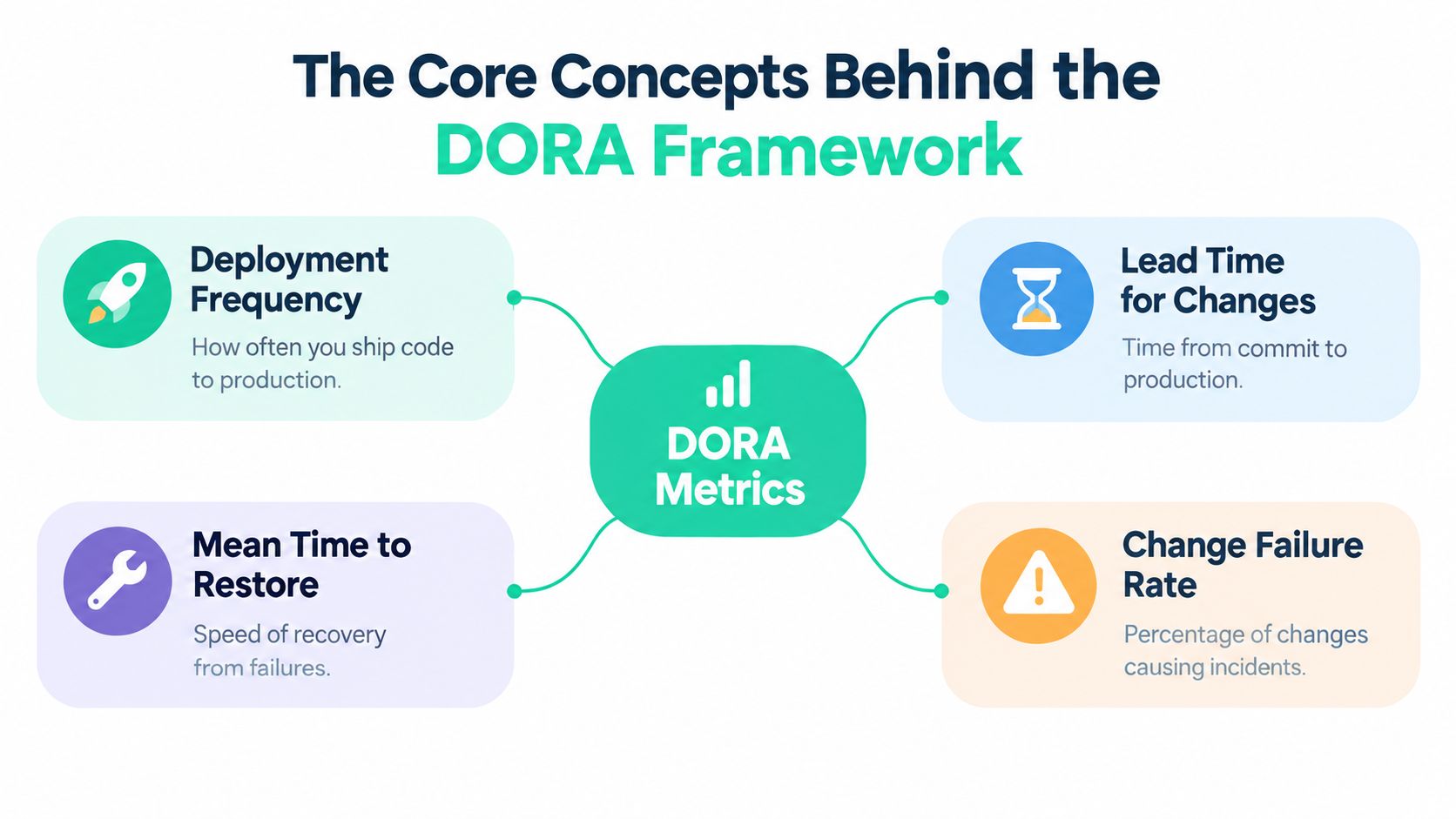
The metrics work together. Deployment frequency and lead time describe throughput. Recovery time and change failure rate describe instability and response. Publishing only throughput can make unreliable delivery appear successful. Publishing only failures can hide a team that ships, learns, and restores service effectively.
The framework reached a broad audience through survey-based industry research. One paper reports that the DORA group used data from 33,000 respondents to publish industry averages, helping establish a shared benchmark vocabulary. The sample gives the framework reach, but it does not make any repository automatically comparable. Founders should publish their definitions, measurement window, and release evidence so backers can judge the signal rather than accept an unexplained score.
How GitHub Surfaces and Tracks Delivery Data
GitHub contains much of the raw material for DORA measurement, but it doesn't automatically contain the complete story. Commits, pull requests, tags, workflow runs, and deployment records can establish when work was created and when a pipeline ran. They don't necessarily establish whether a release caused an incident or when service returned to normal.
Map the event chain
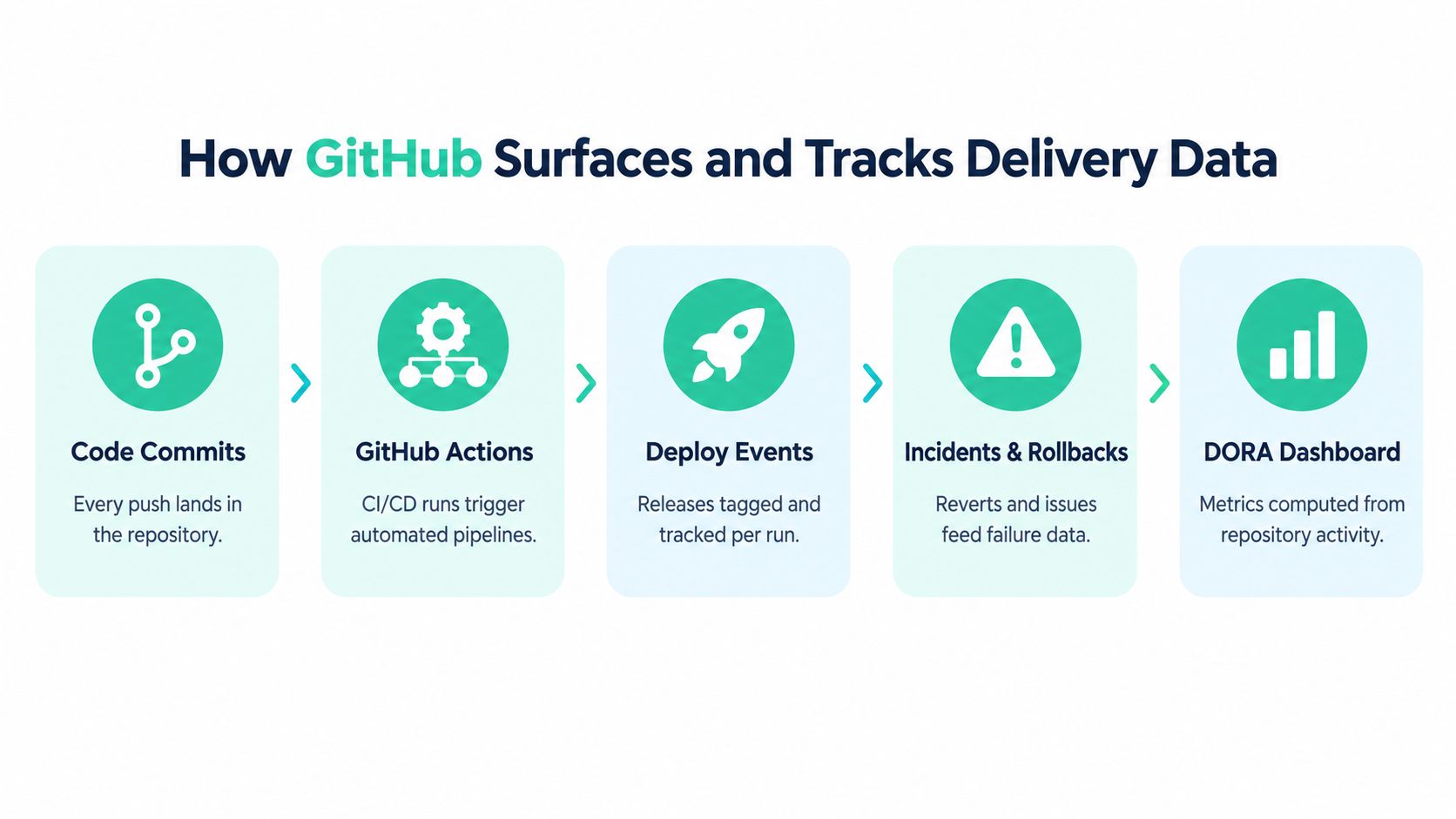
A practical GitHub pipeline joins several events:
- Commit creation: the repository records the change.
- Workflow execution: GitHub Actions tests, packages, or prepares the release.
- Deployment: a successful delivery event marks when the change reached production.
- Incident or rollback: an external system records whether the release failed.
- Metric calculation: the pipeline correlates those timestamps into DORA values.
GitHub-based implementations measure lead time from commit to production deployment, deployment frequency from successful deployments over a period, recovery time from failure to recovery, and change failure rate from deployments requiring immediate intervention, as defined in the DORA guide to delivery metrics.
Where native GitHub data stops
GitHub Actions can help collect deployment and workflow timestamps, but it can't natively know that a deployment caused a customer incident unless your team records that relationship somewhere. A failed workflow isn't the same as a failed production change. Likewise, a rollback may happen outside GitHub, and an outage may be tracked in an incident platform rather than an issue.
That creates an event-correlation problem. The system needs to join the commit with the deployment that shipped it, then join the incident or rollback with the deployment responsible for the failure. Raw repository activity alone can't perform that attribution reliably.
A DORA dashboard is only as trustworthy as the release and incident identifiers behind it.
Use consistent deployment IDs, production timestamps, and incident labels. If your release process creates an immutable deployment record, you can connect it to the commits included in that release. If incidents have a clear affected-deployment field, recovery calculations become auditable instead of approximate.
Teams that are consolidating repository, release, and other marketing data can also review this practical guide to integrating data sources. The same principle applies here: define the source of truth for each event before calculating a headline number.
A useful implementation can start small. Instrument production deployments first, document what counts as failure, and add incident integration once the release data is stable. A smaller, transparent dataset is more valuable than a polished dashboard built on ambiguous joins.
Interpreting Benchmarks and Elite Performance Tiers
Benchmarks help only when founders understand the comparison behind them. A young product with infrequent releases may be operating well if each release is deliberate and delivers meaningful improvements. A high-volume team may be struggling if frequent deployments repeatedly require intervention.
Recent DORA research gathered responses from approximately 5,000 technology professionals across industries and company sizes worldwide, according to the 2025 to 2026 DORA report summary. Across seven published years, elite-quartile performance accounted for roughly 15% to 20% of respondents. Elite delivery is therefore a minority condition, not a baseline that every small team should copy.
| Metric | Elite Performers | Average Teams |
|---|---|---|
| Delivery profile | Consistently strong throughput and stability | Mixed results across speed and reliability |
| Change failure rate | A minority benchmark, with 16.7% of surveyed teams reporting 4% or lower | Often higher or less consistently recorded |
| Interpretation | A reference point for mature delivery systems | A realistic comparison group for most teams |
The change failure figure shows how DORA makes operational quality comparable. The report identifies 16.7% of surveyed teams with a change failure rate of 4% or lower. That result can demonstrate what mature delivery systems achieve, but it should not become an automatic target for every founder. A low rate may be achievable while remaining uncommon across the surveyed population.
Use benchmarks as questions, not rankings
Ask four questions before presenting a benchmark to a team or backer:
- Is the measurement complete? If incidents are not connected to deployments, the failure rate may appear better than reality.
- Is the time window useful? A low-volume project can produce unstable averages because a small number of releases has a large effect.
- Is the comparison fair? Monorepos, trunk-based workflows, and release branches can produce different event patterns.
- Does the metric reflect product improvement? A better number that does not correspond to safer or more useful releases may be noise.
External reporting should place the definition beside the value. State whether deployment frequency includes staged releases, how failures are classified, and whether recovery starts at detection or first response. Backers can then distinguish a reproducible delivery signal from a carefully selected benchmark. Credibility comes from showing how the measurement can be recreated, not from choosing the most flattering comparison.
Turning Repository Data into Verifiable Traction
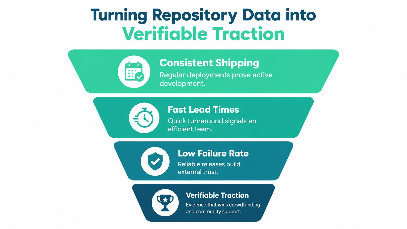
Repository activity becomes useful to backers only when it connects to shipped product. A commit graph shows that work happened. A defined delivery record can show a repeatable path from code change to release, plus a process for accounting for failures. That distinction gives a crowdfunding page proof of work rather than another launch promise.
Translate engineering signals into backer questions
Each DORA metric answers a different execution question:
- Deployment frequency: Is the team regularly putting product changes into production?
- Lead time: How quickly can a completed change move through the release process?
- Recovery time: How does the team respond when a release causes a problem?
- Change failure rate: Can the team ship at speed without sacrificing release safety?
These signals cannot establish revenue, retention, or product-market fit. They add a verifiable execution layer. Pair them with customer, revenue, or audience evidence when available, and label each measure so backers do not confuse shipping activity with demand.
Publish evidence without exposing sensitive details
Founders can demonstrate delivery discipline without publishing private source code or operational secrets. A public traction page can show aggregate release signals, metric definitions, and update dates while keeping proprietary implementation details private.
Fundl can provide this presentation layer. It connects a creator's GitHub repository through the GitHub API and displays live commit activity, including commit frequency, recency, commit count, contributor count, and last commit date, based on the product materials provided for this article. Those signals can appear beside other traction sources on a shareable page. Present them as shipping activity, not evidence that customers are buying. For practical guidance on framing evidence for external audiences, see how to show traction to investors.
Backer-facing principle: Show what the data verifies, and state what it does not.
A credible page can describe the release workflow, display recent deployment cadence, and connect every metric to a plain-English definition. A period without deployments may reflect planned stabilization or a deliberate product choice. That context is more persuasive than a dashboard that conceals irregular results.
The same approach improves campaign updates. Share a live page instead of posting occasional screenshots only when attention is needed. Explain meaningful changes, such as a new release process, better recovery discipline, or a shift in the work being shipped. The metric starts a conversation. It does not replace one.
Common Pitfalls and the Limits of Causation
DORA metrics are useful diagnostic signals, but they aren't causal proof that a team will succeed. The 2026 synthesis explicitly warns against treating any single DORA metric as a causal explanation of organizational performance and describes a segmented refresh designed to test whether familiar conclusions hold across different team contexts, as discussed in the 2026 DORA metrics synthesis.
That warning should change how founders present GitHub data. A faster lead time doesn't prove better product decisions. More deployments don't prove stronger demand. A low recorded failure rate may reflect incomplete incident capture rather than unusually reliable software.
Watch for measurement gaps
GitHub-based tracking commonly breaks in predictable places:
- Incomplete failures: GitHub may know that a workflow passed, but not that users reported a production incident afterward.
- Low deployment volume: A small number of releases can make trends jump sharply from one period to another.
- Non-standard branching: Commits may be hard to map to production when branches remain open or releases are assembled manually.
- Unclear recovery boundaries: Teams may record detection, acknowledgement, rollback, and restoration at different times.
- Metric pressure: If founders or teams are rewarded for speed alone, they may split changes artificially or avoid recording failures.
The guidance on GitHub DORA tooling limitations makes the central limitation clear. GitHub Actions can approximate some measures, but change failure rate and time to restore service depend on incident data outside the pipeline. GitHub data alone can therefore produce incomplete or skewed results.
Decide when a number is decision-ready
A GitHub-derived metric is strong enough to guide a decision when its event definitions are documented, the source data is complete enough for the decision, and the team can explain exceptions. It isn't decision-ready when nobody knows which deployments count, incidents aren't connected to releases, or a trend changes because the workflow changed rather than the product.
Use data accuracy practices for traction reporting to audit those definitions before publishing a number. For internal use, treat anomalies as prompts for investigation. For external use, include caveats beside the metric, not in an obscure methodology page.
The contrarian position is simple: a modest, qualified signal beats an impressive but untraceable one. DORA should help you make better decisions and communicate execution clearly, not manufacture certainty.
Next Steps for Building a Transparent Traction Pipeline
Start with the path your code follows today, not the dashboard you wish you had. Write down how a change moves from commit to review, from review to deployment, and from deployment to incident response. Most founders discover that the missing piece isn't another analytics tool. It's an undefined event boundary.
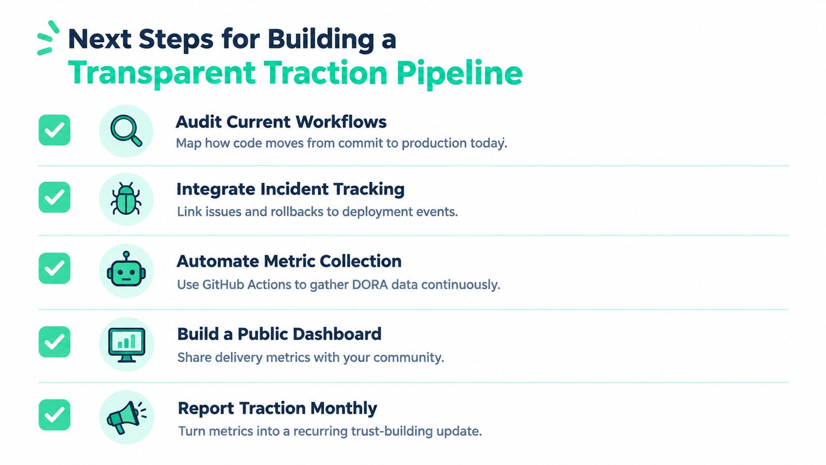
Build the pipeline in five passes
Audit current workflows. Identify the production deployment event and the repository data attached to it. Record whether GitHub Actions, a hosting provider, or a manual process owns the timestamp.
Integrate incident tracking. Decide where rollbacks, hotfixes, and service incidents live. Link each record to a deployment identifier whenever possible.
Automate metric collection. Use GitHub Actions or your delivery platform to collect commits, workflow runs, release events, and deployment outcomes continuously. Keep a written definition for every metric.
Build a public dashboard. Publish aggregate delivery signals on a shareable traction page. Separate repository activity from production delivery, and add a short note explaining limitations.
Report traction monthly. Review the page with your community and explain meaningful changes, including slower periods, reliability work, or changes in release practice.
A solo founder can begin with a simple release log and a small set of GitHub events. A growing team should add deployment IDs and incident links before it publishes comparative trends. In both cases, assign one person responsibility for definitions and data quality, then review the signals on a regular cadence.
Don't wait for perfect instrumentation before showing progress. Publish what you can verify, label what remains approximate, and improve the pipeline as the product grows. That habit gives backers a clearer view of execution than a contribution graph ever could.
Fundl lets founders connect GitHub and other live data sources to a shareable traction page, so backers can see current build activity alongside the signals that matter to the project. Visit Fundl to set goals, link your data, and turn your delivery evidence into a transparent crowdfunding update.