

A founder watches signups climb after a launch and assumes onboarding is working. Then a feature release changes the first-run experience, and the next cohort behaves differently. Accounts are still created, the checklist still gets completed, and the dashboard still looks busy, but fewer users connect a real data source, publish anything useful, or return to inspect the result.
That gap is where most onboarding problems hide. SaaS onboarding metrics only become useful when they connect a new account to a verifiable value event, then show whether that event predicts continued use, conversion, sharing, or contribution. Signups and tour completion describe activity around the product. Activation shows whether the product has started proving its value.
Table of Contents
- Why Most Founders Measure Onboarding Wrong
- Activation Rate and Time to First Value Explained
- Mapping the Activation Funnel Stage by Stage
- Tracking These Metrics With Live Analytics
- The Onboarding Scorecard Founders Actually Use
- Why Faster Onboarding Is Not Always Better
- Four Onboarding Experiments You Can Ship This Month
- Building a Metric-Driven Onboarding Loop
Why Most Founders Measure Onboarding Wrong
The founder in this scenario may notice the problem only after opening a cohort report. The overall signup count is rising, yet the signup-to-activation transition has weakened since the release. Users still create accounts, but they don't complete the action that makes the product useful.
That dashboard looked healthy because it mixed different questions together. Signups measure acquisition, onboarding completion measures procedural progress, and activation measures experienced value. A user can finish a profile, click through a tour, and never reach the product's core outcome.
Averages hide the leak
An overall activation average combines users with different acquisition sources, plans, product types, and levels of intent. A founder-led launch may bring highly motivated users who tolerate manual setup, while a broader campaign brings people who need more explanation. The aggregate number can stay stable while one important cohort collapses.
Cohort analysis exposes that difference. Group users by signup week, acquisition source, plan, or product type, then compare the transition from signup to the first qualifying action and from that action to value. A low activation rate usually points to a problem with understanding, configuration, or perceived benefit. A long time to value points to setup friction, even when users eventually activate.
Practical rule: Every onboarding metric should answer a specific question. If you can't name the decision it supports, it probably doesn't belong on the primary dashboard.
The gap between “signed up” and “got value” also explains why checklist completion is a weak north star. A checklist can tell you whether users followed instructions. It can't tell you whether a creator connected a trustworthy data source, whether an AI user got a useful result, or whether a backer found enough evidence to act.
Before choosing an onboarding tool or redesigning a flow, define the question first:
- Did users reach value? Use an activation event and activation rate.
- How quickly did they reach it? Measure time to first value by cohort.
- Did value persist? Compare day-seven and day-thirty behavior.
- Did onboarding affect the business? Connect activation with paid conversion, contribution, sharing, or invitations.
Those questions turn a busy dashboard into an operating system for product decisions.
Activation Rate and Time to First Value Explained
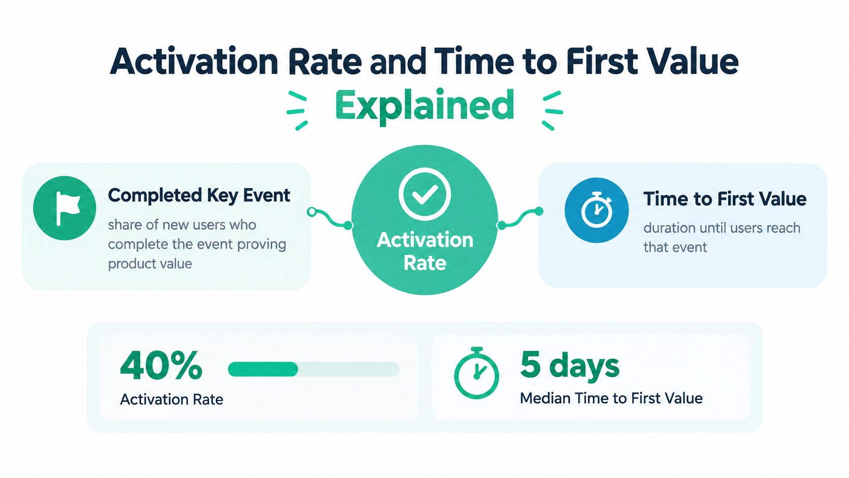
A new user can finish every onboarding step and still leave without proving the product works. Activation rate is the share of new users who complete the behavior that demonstrates initial product value. Time to first value measures the time required to reach that behavior. Read them together: a product may activate a reasonable share of users slowly, or produce fast but shallow actions that predict little.
Define the value event before choosing either metric. For an indie SaaS product, that might mean connecting Stripe or GitHub, publishing a live traction page, or sharing a verified metrics URL. For an AI tool, it could mean completing a useful workflow and exporting or applying the result. A consumer app may define it as creating something, sharing it, or returning to use the outcome.
Choose evidence over motion
Opening an email, viewing a welcome screen, or completing a tour can indicate progress. None proves that the product delivered its promised outcome. For indie SaaS and AI tools, activation should connect to real data, real usage, or a usable result rather than checklist completion.
Test the event against three questions:
- Do activated users retain better than non-activated users? Compare later behavior instead of assuming the event matters.
- Does the relationship hold across meaningful cohorts? If activation predicts retention only for one acquisition source, it may reflect traffic quality rather than product value.
- Does improving the event change downstream behavior? A nudge toward activation should support better retention, conversion, sharing, or another consequential outcome.
For a deeper treatment of connecting product behavior to adoption, see how to measure feature adoption. Define the behavior, instrument it consistently, and test whether it predicts a result that matters.
A benchmark across 62 B2B SaaS companies reports an average activation rate of 37.5%, with average time to value of 1 day, 12 hours, and 23 minutes (benchmark details). Use those figures directionally. A verified traction page has different requirements from a writing assistant, so neither should inherit the other's target blindly.
The useful question is not whether you beat a benchmark. It is which event predicts durable value for your users, and how quickly qualified users reach it.
Mapping the Activation Funnel Stage by Stage
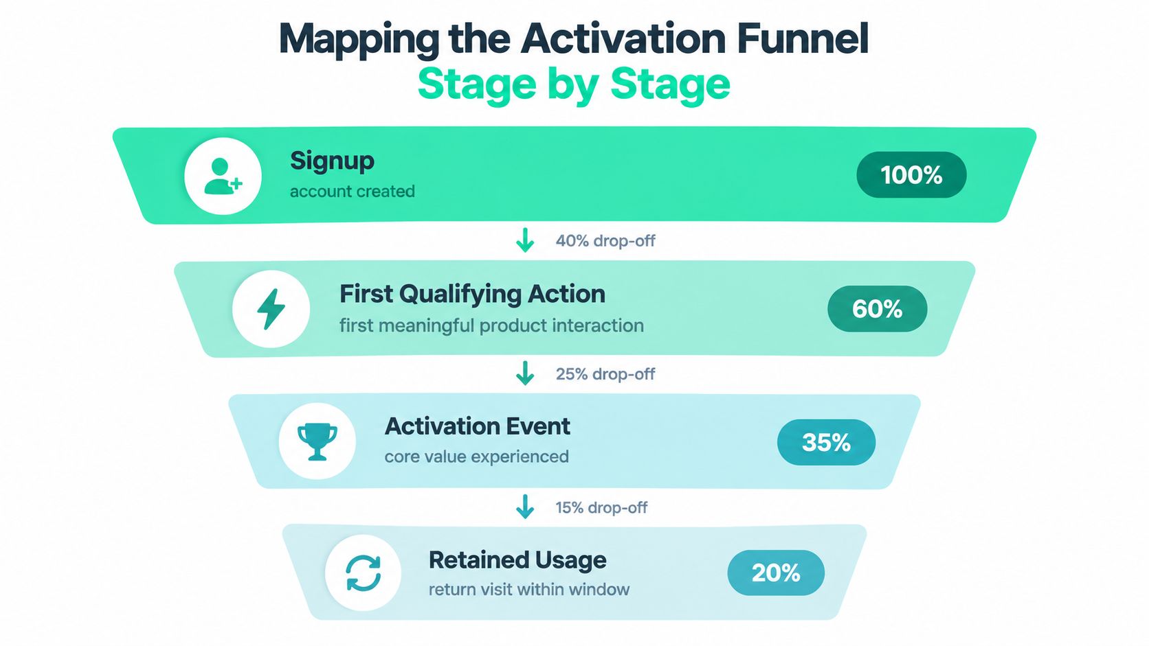
A useful funnel follows the user's movement from intent to evidence, not just their movement through screens. Four stages usually reveal where onboarding breaks: account creation, the first qualifying action, the activation event, and retained usage.
Read transitions, not just totals
Signup tells you that the acquisition promise created enough interest to begin. Track the signup timestamp, source, plan, device or platform where relevant, and the identity that will later connect product activity with email or billing data.
First qualifying action indicates that the user has moved beyond account creation. In Fundl's context, this might be starting a data connection or configuring a project. It isn't yet proof of value, but a weak signup-to-action transition often signals unclear next steps or excessive setup.
Activation is the meaningful value event. A user has connected a reliable source, published a live page, generated a useful AI result, or completed the workflow the product exists to support. Measure both the rate and the elapsed time from signup.
Retained usage tests whether the first value moment led to a reason to return. For a traction product, that could mean reviewing refreshed metrics, updating a project, or sharing the page again. The most revealing leak often occurs between activation and the second session, because the initial task may be complete without creating a continuing need.
Benchmark evidence reinforces the importance of this early sequence. Moving activation from 20% to 40% can correspond to a roughly twofold improvement in early retention, while up to 80% of SaaS signups may abandon the product within the first week (onboarding benchmark context). These are directional figures, not promises for every product.
Use journey mapping explained when the path involves multiple roles or touchpoints. Then reproduce the important transitions in analytics and segment them by signup week, acquisition source, plan, or product type.
A funnel with a strong first action but weak activation needs better proof of value. A funnel with strong activation but weak return behavior needs a second-session reason. Those are different product problems, so they require different experiments.
Tracking These Metrics With Live Analytics
Live analytics should answer one question: did the user receive the product's promised value? Start with a stable event vocabulary that follows that proof, such as account creation, setup started, data source connected, first qualifying action completed, activation achieved, value shared, second visit, and downstream outcome. Avoid tracking every interface click.
Name events for business meaning. data_source_connected remains useful after a redesign, while button_clicked does not explain whether anything worked. Keep event names stable and place changing details in properties, including source type, plan, acquisition channel, project identifier, and verification status.

Confirm value server-side
A client event records an attempt. It cannot always confirm that the product delivered a usable result. If a user connects Stripe or refreshes analytics, emit the success event only after the connection or refresh completes and the returned data passes validation. For indie SaaS and AI tools, this distinction separates checklist completion from evidence-based traction.
Identity stitching determines whether the analysis is trustworthy. Join anonymous browsing, account creation, product usage, email engagement, and billing under a consistent user or account identifier. In a multi-user product, retain both the individual actor and the account so personal activity is not confused with team-level activation.
Build cohort views by signup date and acquisition source, then calculate:
- Activation rate, the share of a cohort reaching the validated value event.
- Time to first value, the elapsed time between signup and activation.
- Return behavior, measured within the same signup cohort.
- Downstream outcome, such as payment, contribution, invitation, or sharing.
A 7% top-quartile day-seven return threshold appears in a recent retention benchmark summary, while more than 98% of new users are inactive at two weeks for half of the products in the analyzed sample. Treat those figures as reference points, not targets. Review day-seven behavior before a weak cohort disappears inside a monthly average.
Content-led acquisition needs the same discipline. Pair page visits with product events, and use 8 content performance metrics for 2025 to organize content analysis without treating traffic as adoption. The product event must still show that a user received value.
A real-time metrics dashboard can expose progress to users and backers. Internal analytics should preserve raw events, cohort membership, and verification status, because a live display is only as reliable as the measurement beneath it.
The Onboarding Scorecard Founders Actually Use
A founder's scorecard should be compact enough to review every week and connected enough to explain what changed. Keep acquisition quality, habit formation, and downstream value together, but don't let a single blended score hide the transition where users are dropping.
| Tier | Metric | What it tells you | Review cadence |
|---|---|---|---|
| Acquisition quality | Activation rate | Whether new users reach the evidence-based value event | Weekly |
| Acquisition quality | Median and p90 time to first value | How quickly typical and slower qualified users reach value | Weekly |
| Habit formation | Day-seven return rate | Whether the first value experience creates an early reason to return | Weekly |
| Habit formation | Day-thirty return rate | Whether onboarding supports durable usage | Monthly |
| Habit formation | Weekly active share of new users | Whether recent cohorts are becoming active users | Weekly |
| Downstream value | Paid conversion | Whether activated users move toward revenue | Monthly |
| Downstream value | Contribution rate | Whether evidence and trust lead to support or funding behavior | Monthly |
| Downstream value | Share or invite rate | Whether users distribute the product or bring in collaborators | Weekly |
Use the scorecard diagnostically
Activation rate belongs at the top because it tells you whether the flow reaches the intended value event. Pair it with the median and p90 time to first value. The median shows the typical experience, while the p90 reveals the long tail created by integrations, unclear setup, missing data, or trust checks.
Habit metrics should use fixed cohorts. Don't compare this week's day-seven return with last month's day-thirty return and call the difference a trend. Record signup date, define the retention window, and compare equivalent cohorts over time.
Downstream outcomes keep the team honest. If activation rises but paid conversion, contribution, sharing, or invitations don't move, the event may be too shallow. If time to value falls but qualified outcomes weaken, the team may have removed useful verification rather than friction.
Scorecard discipline: Review the funnel weekly, inspect downstream value monthly, and archive metrics that never change a product decision.
Ignore raw signup volume on this scorecard unless you're using it to explain cohort size. Treat checklist completion as a diagnostic for flow friction, not as proof that onboarding worked. A checklist can reveal where users stop following instructions, but only verified product behavior can show whether they received value.
Why Faster Onboarding Is Not Always Better
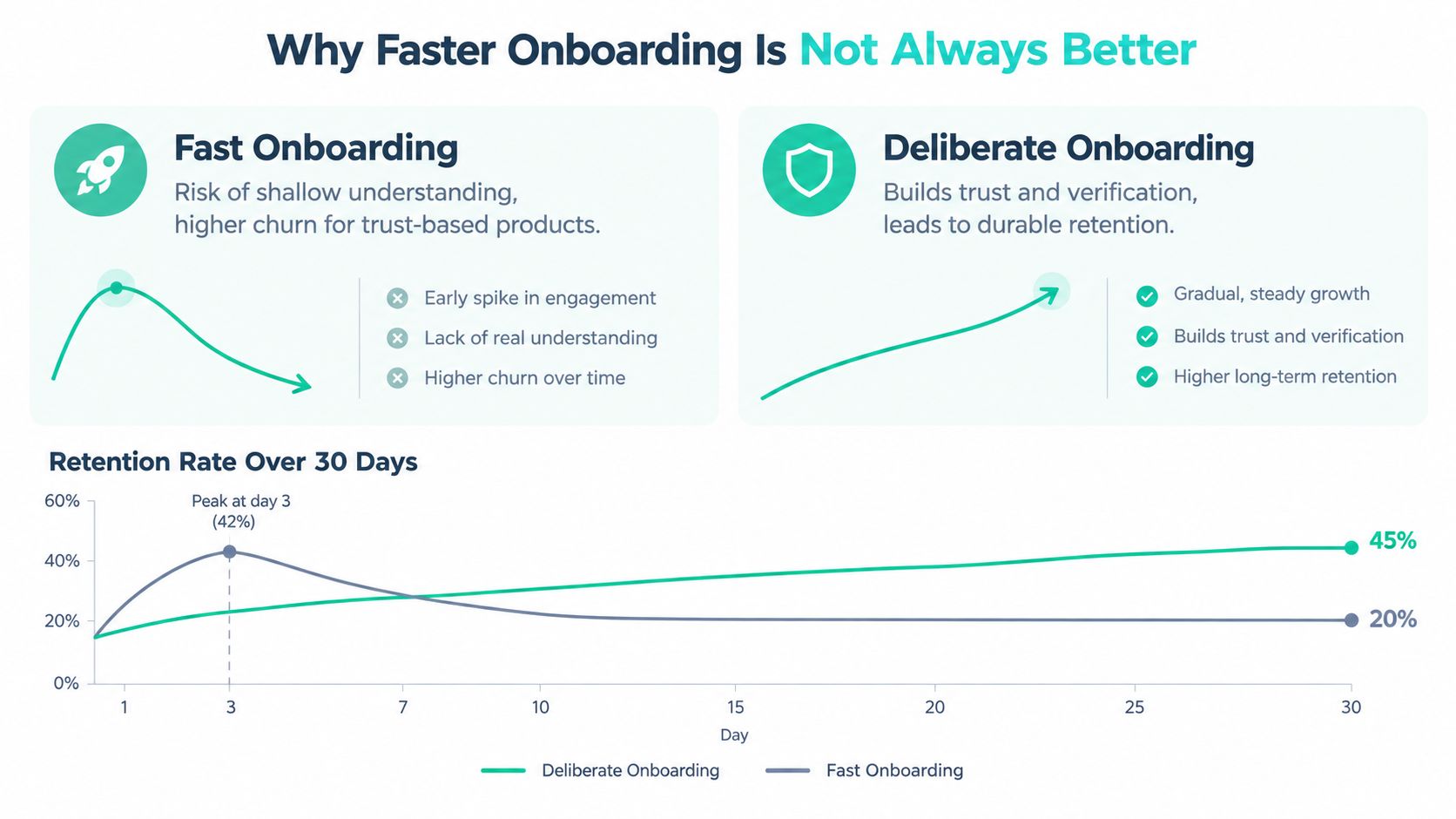
A creator can finish a setup checklist quickly and still have no evidence that the product delivered value. Speed helps when delay comes from confusion, unnecessary fields, or interface friction. It matters less when value depends on trusted data, verification, collaboration, or accumulated evidence. For indie SaaS and AI tools, activation should mark a verifiable value event, not merely a completed sequence of clicks.
Fundl shows the distinction. A creator may begin setup quickly, but connecting Stripe, GitHub, or analytics and publishing source-verified metrics creates a stronger signal than pressing a “finish” button. The connection takes longer, yet it gives the creator and potential backers evidence they can inspect.
Separate speed from signal quality
Measure three distinct moments:
- First-value time, when the user first sees a visible result.
- Verified-value time, when that result is supported by a connected or validated source.
- Consequential-value time, when the user shares, contributes, invites a teammate, or converts to paid usage.
A single median can hide the users who wait much longer because they need integrations, historical data, or a trust check. Compare fast and slow cohorts by later retention and downstream outcomes, rather than treating a shorter average as automatic progress.
A benchmark summary reports that top-quartile activation is approximately 2.3 times higher than the average activation rate of 37.5%, while average onboarding-checklist completion is 19.2% (activation and checklist benchmark). The comparison separates activation from procedural completion. Neither figure is a universal target.
Optimize for speed when delay blocks a value event users already understand. Optimize for signal quality when verification forms part of the value itself.
Fast activation deserves scrutiny if second visits, sharing, or qualified outcomes remain weak. Deliberate onboarding earns its extra steps when each one confirms ownership of real data, reduces uncertainty, or increases trust in what the product shows.
Four Onboarding Experiments You Can Ship This Month
Small teams can improve onboarding measurement without rebuilding every screen. Start with a clear value event, a defined cohort, and a decision rule tied to an outcome that matters.
1. Replace the checklist target
List candidate events that could represent genuine value, such as publishing a project, completing a meaningful AI workflow, connecting a verified source, or inviting a collaborator. Compare each event with later day-seven and day-thirty behavior. Keep the event whose relationship with continued use remains useful across relevant cohorts.
Track qualified activation rate, rather than checklist completion.
2. Remove friction only at the bottleneck
Find the funnel transition with the largest meaningful drop. If users start a connection but do not complete it, clarify permissions, explain why the data matters, and show what the finished result will contain. If users activate but do not return, preserve setup steps that establish trust and create a reason to come back.
Track time to verified value, or the specific transition where users are being lost.
3. Create a second-visit trigger
An activated user may need a timely reason to return after new data arrives, a workflow completes, or a shared page receives activity. Use an email, an in-app notification, a refreshed URL, or a collaborator action. Tie the prompt to a real product event instead of sending a generic reminder.
Track cohort return behavior, especially the movement from first value to repeated use.
4. Instrument one consequential outcome
Choose the business action most closely connected to the product's purpose. For Fundl, that might be a shared traction page or contribution behavior. For an AI product, it might be exporting a result or inviting a teammate. For a SaaS workflow, it may be a paid conversion or a completed team process.
Track downstream value and evaluate each onboarding change against it. A higher activation rate that never affects this outcome may indicate that the activation event is poorly defined.
Document the hypothesis and cohort before shipping, then judge the result against the downstream outcome instrumented in step 4.
Building a Metric-Driven Onboarding Loop
The founder's rising signup chart wasn't useless. It was incomplete. Acquisition created opportunities, but only a clean activation event and a cohort view could show whether those opportunities became product value.
A durable onboarding loop has four habits:
- Choose one value event. Tie it to real data, meaningful usage, or a consequential outcome.
- Instrument it cleanly. Record attempts, verified completion, timestamps, identity, and relevant properties.
- Review cohorts weekly. Compare signup-to-value, value-to-return, and downstream outcomes by source and signup period.
- Ship one focused experiment per sprint. Change the bottleneck, then judge the result against retention or business value.
Set up three items this week. Define the activation event in writing, create a cohort view that shows activation and time to first value, and tag one downstream outcome. For a broader framework on repeat usage, see how to measure product stickiness.
Once those pieces exist, onboarding stops being a collection of screens and becomes a feedback loop. The team can see whether a faster path creates real adoption, whether verification improves trust, and whether the users who activate continue to create value.
Fundl lets creators connect Stripe, GitHub, and analytics data to publish live, source-verified traction pages with metrics that refresh over time. Visit Fundl to turn verified product activity into a shareable funding story and give backers clearer evidence before they contribute.