

A product launch video can earn attention, but attention alone won't fund a SaaS launch. In 2026, 91% of businesses use video for marketing, and 93% consider it important to their strategy according to HubSpot's marketing statistics. The founders who convert that attention don't stop at polished screens and feature lists. They show the product working, connect the promise to a specific use case, and let live traction such as MRR, active users, or shipping activity carry the credibility.
That distinction matters on a crowdfunding page. A viewer may enjoy a clever demo and still hesitate to contribute if the video asks them to trust an unproven claim. A stronger launch asset makes the proof visible, sends viewers to a page where they can inspect it, and gives them one clear action. The result is a product launch video built as a measurable campaign asset, not a brand film that looks finished but leaves the viewer unsure what to do next.
Table of Contents
- Why Product Launch Videos Make or Break Your SaaS Launch
- Define Your Core Message and Proof Before You Script
- Script and Storyboard for Immediate Attention
- Record and Edit for Clarity and Conversion
- Craft CTAs and Test Variations That Drive Backers
- Distribute and Measure What Actually Moves Pipeline
Why Product Launch Videos Make or Break Your SaaS Launch
A launch video can earn attention and still produce few backers. The gap usually appears when the opening, demo, and CTA promise more than the product can prove. A logo animation, founder biography, or broad feature tour may satisfy an internal review, while a new viewer still has not seen the product solve a meaningful problem. SaaS buyers and backers need the outcome quickly, followed by evidence they can assess.
Video has become a standard part of that decision process. HubSpot's 2026 industry data shows near-universal adoption, but adoption does not equal conversion. Views remain a common success measure, yet they mainly show whether the opening earned attention and distribution. They do not confirm that viewers trusted the product, clicked through, or contributed.
The problem with feature-first launches
A feature list makes the viewer do the strategic work. They must determine who the product serves, which workflow changes, and why the launch deserves support. That friction is costly for indie hackers, developer-tool founders, and app teams competing with familiar alternatives.
Traction-anchored messaging reduces the guesswork. Instead of saying, “Our platform helps teams manage deployment,” show the deployment workflow and place a verified proof point beside it. MRR can support a claim of commercial demand. Active users can show continued usage. Recent commits can demonstrate that the team is still shipping. Each metric has a job, and none should appear as decoration. The proof should match the promise the viewer just heard.
A crowdfunding video should make that connection visible. If the hook claims growing demand, show the relevant MRR or active-user evidence. If the demo claims faster execution, show the workflow and the resulting action. If the CTA asks for a contribution, link it to a page where viewers can inspect the product and traction before deciding.
Practical rule: Every major claim in the video should have a visible product moment or a verifiable traction signal beside it.
Build one core video, then adapt its strongest sections for a landing page, Product Hunt, LinkedIn, X, email, and a crowdfunding page. Create alternate hooks and CTAs without rebuilding the entire production. This modular approach protects the schedule and lets you test whether attention, proof, or the offer is causing drop-off as the campaign changes.
Build the video around a decision
A product launch video should answer one question for one audience. For a developer tool, the question may be whether it removes a painful deployment step. For a consumer app, it may be whether the viewer can complete a familiar task with less friction. For a crowdfunding campaign, it may be whether verified traction justifies a contribution.
Founders seeking a broader launch system can study these founder product launch tactics, especially the connection between audience preparation, distribution, and timing. Video performs better when it has a defined destination, a measurable next action, and proof that gives viewers a reason to take it.
Define Your Core Message and Proof Before You Script
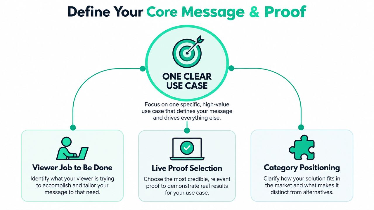
Don't open a script document until you can finish this sentence:
For [specific audience], [product] helps them [one important job] by [distinctive mechanism], proven by [live evidence].
That sentence keeps the video from becoming a compressed product tour. It also gives you a filter for every visual, line of voiceover, and metric you include.
Choose the viewer's job
Start with the job, not the persona label. “Indie hackers” is too broad to direct a scene. “A solo founder needs to show prospective backers that the product has real usage” is specific enough to shape the video.
List the audience's current workflow, its costly or frustrating step, and the result they want. Then choose one use case that demonstrates the change clearly. A developer-tool video might show a commit moving from code review to deployment. An analytics product might show a founder replacing scattered dashboards with a single decision view.
Avoid combining unrelated jobs. A video that tries to speak equally to enterprise buyers, casual app users, and technical contributors usually becomes abstract. Make one audience feel understood, then create a separate cutdown or campaign for another segment.
Select proof that supports the claim
Use the strongest live metric that answers the viewer's likely objection.
- Commercial demand: Use current MRR when the question is whether customers pay for the product.
- Product usage: Use active-user data when the question is whether people return and rely on it.
- Shipping momentum: Use recent GitHub activity or commits when the audience needs confidence that development is active.
- Audience interest: Use a relevant analytics signal when the claim concerns reach or adoption.
Don't overload the frame with every metric you have. A proof stack should have one lead signal and supporting context. For example, place MRR beside a checkout or billing view, then use active users later when showing continued usage. Keep the evidence current and make the source clear on the destination page.
A concise messaging optimization for landing pages can help pressure-test the promise before production. If the value proposition needs several sentences to explain, the video will struggle to communicate it quickly.
Write the message hierarchy
Put the information in this order:
- Problem: Name the specific frustration or risk.
- Product: Show the product that changes the workflow.
- Outcome: Explain what the viewer can now do.
- Proof: Display the live traction supporting the claim.
- Action: Send the viewer to one destination.
The proof shouldn't appear as decorative validation at the end. Place it at the moment the viewer might question the promise. If you claim that users rely on the product, show the active-user signal beside the workflow. If you claim that the business is generating revenue, connect the MRR figure to the product's paid experience.
Script and Storyboard for Immediate Attention
A viewer may leave before the product has appeared, so the opening must earn attention with a concrete problem and verified traction. Flowjam's 2026 launch-video index recommends showing the product within the first 3 to 10 seconds, keeping the core asset between 30 and 90 seconds, and tying it to one clear use case or category. The index also reports that 73% of viewers leave before 15 seconds and that 12 of the top 15 successful launches ran between 30 and 90 seconds. Treat those findings as a pacing constraint, then use your own MRR, active-user count, or conversion data to decide which proof deserves screen time.
Build a five-beat narrative
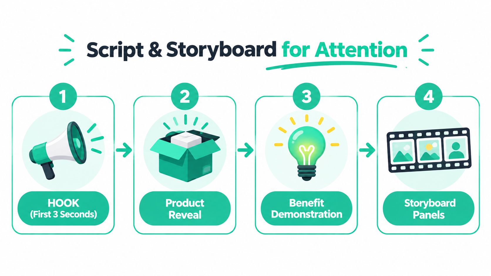
Draft the video in five beats:
- Hook: State the costly frustration or show the desired result immediately.
- Reveal: Put the product on screen and name it.
- Demonstration: Show one workflow from input to outcome.
- Proof: Display the live metric that supports the claim.
- CTA: Direct the viewer to one destination.
A SaaS example could open with a founder switching between disconnected dashboards, then cut to the product consolidating the data and producing a decision view. The voiceover should explain the operational change in plain language, while the screen proves it. Avoid narrating every button.
Tie each beat to evidence you can verify. If the hook promises faster decisions, show the workflow that creates them. If the product is already generating MRR, place that figure beside the relevant paid experience. If active users demonstrate ongoing adoption, show that signal after the workflow rather than presenting unrelated numbers at once. A single lead metric with supporting context is easier to understand and harder to challenge.
Write from the visual backward. If the screen cannot demonstrate the claim, narrow the claim or add a proof scene. This keeps the narration, interface, and traction evidence aligned instead of leaving the viewer with a polished mockup and an unsupported promise.
Storyboard the evidence and timing
Create a four-column table with time, visual, voiceover, and on-screen text. Mark the product state at each transition, including the exact treatment for proof, such as “MRR shown on traction page” or “active users shown beside usage workflow.” Decide these details before editing.
Keep UI captures deliberate. Move the cursor only when it guides the workflow, zoom into the relevant area, and remove loading delays or irrelevant navigation. Technical viewers can handle detail when each step leads to a visible payoff.
The embedded example can help you assess pacing, hierarchy, and how quickly the demonstration establishes context.
Reserve room for action
Do not spend the full runtime explaining features and compress the CTA into a final frame. Give viewers time to read the destination, understand what the page contains, and act.
For a crowdfunding launch, direct viewers to a page that pairs the video with the underlying proof. The guidance in this overview of effective crowdfunding pages supports that evaluation process. Your video should make the claim and establish interest. The page should let a backer inspect the evidence and move from interest to contribution.
Prepare the cutdown shot list before recording. Capture clean moments for a vertical hook, a proof-focused clip, a workflow demonstration, and a founder explanation. Recording those assets in the same session is faster than arranging a rushed reshoot.
Record and Edit for Clarity and Conversion
Production quality supports credibility, but clarity drives action. A founder speaking into a decent microphone while showing the product can outperform polished animation that avoids demonstrating how the product behaves. Tie each visual choice to proof a backer can verify, such as current MRR, active users, or a workflow that reflects live usage.
Choose the right recording format
Use a talking head when the founder's credibility supports the offer. This fits an early product, a campaign built on trust, or a story that requires the founder to explain why the problem matters. Keep the delivery direct. Record several short takes instead of trying to produce one flawless monologue.
Use pure screen capture when the workflow carries the argument. Developer tools, analytics products, and apps often need the viewer to see the interface respond. A hybrid format usually gives you more control: a brief founder opening, a focused demonstration, and a closing proof or CTA tied to the campaign destination.
Record the interface in the state you want viewers to remember. Remove personal data, prepare realistic sample records, and avoid workflows that depend on features likely to change before launch. Authenticity comes from showing the product clearly, not from exposing an unprepared workspace.
Edit for comprehension
Cut pauses, repeated explanations, and setup screens first. Apply the length constraint during the edit, then check whether the remaining demonstration still completes the workflow without padding. A short, complete explanation is stronger than a longer sequence filled with brand language.
Captions should carry the core message when sound is off, without turning the frame into a wall of text. Use music only when it supports comprehension. If the soundtrack competes with the voiceover or makes the product feel more dramatic than it is, remove it. UI clicks, deliberate cursor movement, and short zooms can provide enough rhythm for a technical launch.
Review every cut against the proof. If a zoom hides the metric, a transition interrupts the workflow, or a caption makes a claim the screen does not support, change the edit. The live traction page should remain the reference point for what the video promises.
Build for change
Fast-moving SaaS teams should not treat the launch file as permanent. Separate the voiceover, UI captures, proof screens, captions, and end card so you can update one layer without rebuilding the full edit.
AI tools make this modular approach more practical. Arcade's coverage of product launch strategies describes a shift toward prompt-based AI product videos that can be regenerated when the product changes. It reports that 62% of Growth-tier customers shipped at least one prompt-based launch video within 48 hours of feature general availability during a rolling 30-day window ending July 2026, with cross-format cutdown output up 3.1x year over year. Treat those figures as evidence of a production trend, not permission to automate judgment.
AI-generated scenes can speed up versioning, but fabricated product behavior can destroy trust. Use real captures for the feature carrying the claim, review every generated frame, and keep the proof layer connected to live data.
Craft CTAs and Test Variations That Drive Backers
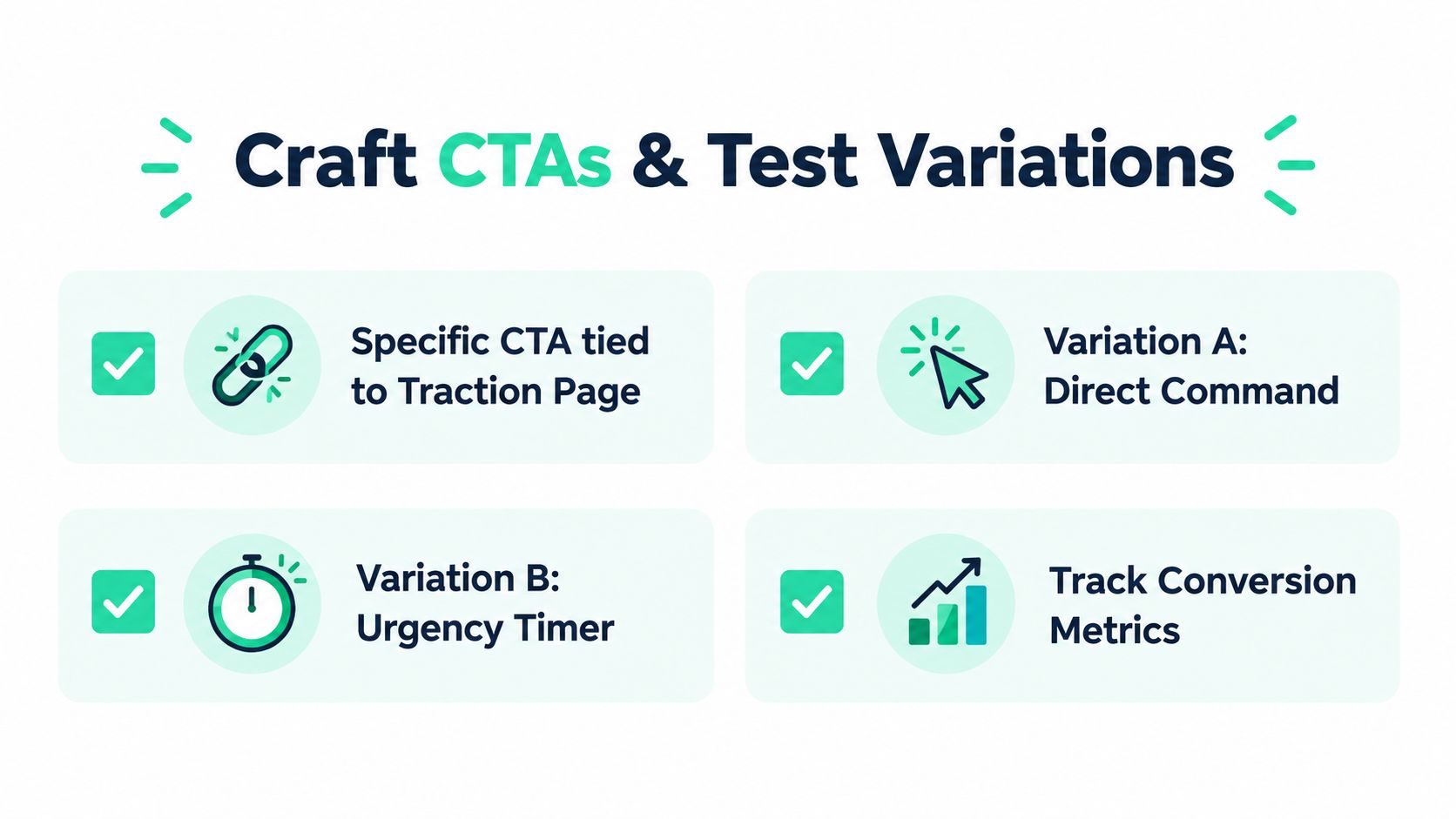
A CTA fails when it asks for a vague emotional response. “Learn more” gives the viewer no reason to click and no expectation about what happens next. A crowdfunding video should tell the viewer to inspect the traction page, review the live evidence, and contribute if the project fits their criteria.
Make the destination part of the script
Write the CTA around the page, not the video. For example, “See our live MRR, active users, and shipping activity, then support the next release” tells the viewer exactly what evidence awaits them. If the campaign accepts contributions through a connected Stripe account, make the contribution path clear without adding unnecessary payment explanation to the creative.
The end card should contain one action, one URL or button destination, and one reason to act. Don't place a newsletter signup, demo request, social follow, and contribution request in the same frame. Multiple options dilute the decision.
For broader funnel work, this guide to improving conversion rates offers useful context on reducing friction between interest and action. Apply the same principle to the video. The viewer shouldn't have to decode what “support us” means.
Create controlled variations
Test one variable at a time. Start with two hooks:
- Problem-led: “You shouldn't need three tools to see whether your launch is working.”
- Proof-led: “Our live traction shows how founders are using this workflow.”
Then test the CTA while keeping the opening and product demonstration fixed. A direct command may suit a warm audience, while a proof-oriented invitation may work better for skeptical backers.
Keep separate tracking links for each version and record the result at the destination. Views can identify the stronger hook, but click-throughs and completed contributions tell you whether the message produced intent. Don't declare a winner from reach alone.
Design for channel and audience
Create a horizontal hero version for the campaign page and clean vertical cutdowns for social feeds. Use captions in every cutdown, but rewrite the opening text for the channel instead of cropping the hero asset and hoping it survives.
Segment the message. Existing users may need to understand what's new, while prospective backers need to see why the product deserves support. A single video can serve both groups if the core demonstration remains consistent, but the hook and CTA may need separate versions.
Distribute and Measure What Actually Moves Pipeline
Publishing the video is the start of the campaign, not the finish line. Place the core asset where high-intent viewers make decisions, then adapt the opening for discovery channels. Product Hunt and X can create initial awareness, LinkedIn can reach professional buyers, YouTube can hold the complete demo, email can activate an existing audience, and the Fundl traction page can give backers a place to inspect the evidence before contributing.
The channel should determine the edit. A feed post needs a self-contained opening because many viewers won't read the accompanying copy. An email can introduce the problem in text and use the video as the proof. A campaign page can let the viewer move from the video to live metrics and contribution details.
Use a four-layer measurement model
LeVitate Media's product launch video strategy recommends measuring across reach, engagement, conversion, and pipeline influence. This keeps the team from optimizing a creative asset for views when the business needs qualified actions.
| Layer | What to track | What it diagnoses |
|---|---|---|
| Reach | Views, impressions, and play rate | Whether distribution and the thumbnail earn attention |
| Engagement | Watch time, completion, and drop-off points | Whether the hook and narrative maintain interest |
| Conversion | Click-throughs, demo requests, trial signups, or contributions | Whether the offer and CTA create action |
| Pipeline influence | Influenced deals and time-to-close | Whether the video assists revenue progression |
Review the data by version and channel. A strong play rate with an early drop after the product reveal suggests a mismatch between the hook and the demonstration. Strong completion with weak clicks points toward the CTA, destination page, or offer. Strong clicks with weak contributions usually means the page isn't providing enough proof or reducing enough friction.
Connect creative decisions to commercial outcomes
For SaaS, label the events that matter after the click. Track trial activation, qualified demo requests, sales conversations, and influenced opportunities where your analytics setup supports them. For crowdfunding, track visits to the traction page, proof-section engagement, and completed contributions.
Use campaign parameters on every published link and keep a simple record of the hook, length, audience, and CTA in each version. Review early performance, then inspect the longer tail after enough traffic has accumulated to reveal whether the video attracts the right people.
Visual standards vary by category. A SaaS demo needs readable UI and credible proof, while premium references such as luxury brand social videos demonstrate how pacing, composition, and visual consistency can shape perception. Borrow the discipline, not the surface style. A founder-led product launch should still look like a real product being shipped.
Community response can improve the campaign when the team answers objections publicly and turns recurring questions into cutdowns. The practical guidance in Fundl's community engagement strategies is relevant when supporters need more than a polished announcement. Let questions reveal which proof, workflow, or metric the next version should clarify.
Fundl lets creators publish a shareable traction page with live, source-verified metrics such as MRR, weekly commits, and Monthly Active Users, then receive reward-based contributions directly through their connected Stripe account. Use a product launch video to introduce the product, send viewers to that evidence, and visit Fundl to set up a transparent funding page for your next release.